 I designed a new concept magazine, i decided to create a unsigned magazine to highlight how good some unsigned artists are. I worked independently on my piece. I liked my main image for my front cover as i know it breaks the conmventions but, i think it works really well and it works well with the genre i have chosen which was Indie/Rock. I wanted to keep my piece minimalistic as i think magazines that have too much pictures, fonts and colours look unprofessional. I chose the name 'Unsigned' as it's clear and to the point as like say 'NME' which stands for 'New Music Express'. Also, the name stands out on a shelf full over magazines. The artists i created was 'Lizzie Young', she is a singer/song writer with a bit more edge and more experimental. I based her on artists like ADELE, Marina Diamandis, Florence Welch Lily Allen and Santogold.
Q1. In what ways does your media product use, develop or challenge forms and conventions of real media products?
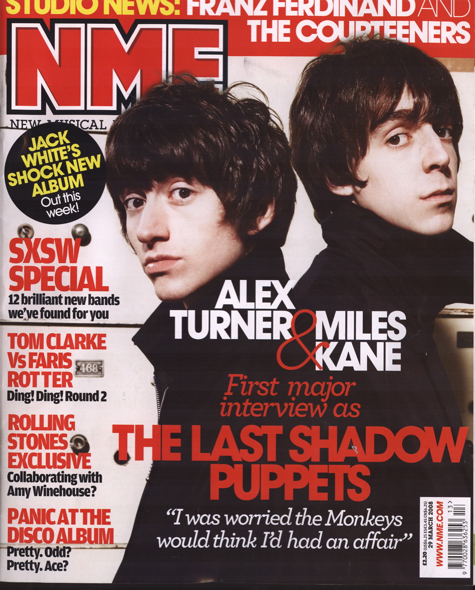
My magazine is a unsigned/Indie magazine, which was influenced by magazines such as NME and Kerrang. I tried to follow the conventions in some ways like colour scheme, props and layout. These three things are important to keep as close to the convention as possible as they are the foundations of the magazine genre. This Lilly Allen Spread was a typical magazine piece that
 insprired me with my piece, i liked the font for 'Lily Allen takes on the world' as it is like the genre of music itself, mix and match and no particular style. I also like the way she is dressed, in a simplistic manner, as so not to divert your attention away from the face. However, in my article my main image on my front cover breaks the conventions of the genre as my artist does not directly address the camera. Instead, they are are looking down and their whole face cannot be seen. I tried to use the same dress style for my front cover as the Lily Allen front cover. Also, i gave my front cover a more
  minmalistic house style as i did not want to detract from the main image which i think itself is simple yet effective. I also used only one colour, a dark red. This is breaking the conventions as we see with the NME magazine there is an aray of colours. I also think using a woman on the front cover of the magazine is slightly breaking the conventions as this genre is a male-dominated genre with most of the readers of the magazine also being male. However, even though i broke some conventions, my audience feedback recognised the magazine is a Unsigned/Indie magazine.
insprired me with my piece, i liked the font for 'Lily Allen takes on the world' as it is like the genre of music itself, mix and match and no particular style. I also like the way she is dressed, in a simplistic manner, as so not to divert your attention away from the face. However, in my article my main image on my front cover breaks the conventions of the genre as my artist does not directly address the camera. Instead, they are are looking down and their whole face cannot be seen. I tried to use the same dress style for my front cover as the Lily Allen front cover. Also, i gave my front cover a more  minmalistic house style as i did not want to detract from the main image which i think itself is simple yet effective. I also used only one colour, a dark red. This is breaking the conventions as we see with the NME magazine there is an aray of colours. I also think using a woman on the front cover of the magazine is slightly breaking the conventions as this genre is a male-dominated genre with most of the readers of the magazine also being male. However, even though i broke some conventions, my audience feedback recognised the magazine is a Unsigned/Indie magazine.
 Q2. How does your media product represent particular social groups?
I think my media product represents both genders aged 14-21, women and men in this genre are put on a equal level. Many artists such as Florence Welch from Florence + The Machine and  Marina Diamandis from Marina and the Diamonds are some of the best of their genre and are well respected. So, i have represented females with my cover spread artist a woman and the way i dressed my artist in typical female clothing. However, i also think that i have not shut off my magazine from men as their are other bands and male artists mentioned in my magazine. I think the informality of the interview helps it the magazine relate to the audience. But overall, i feel the magazine represents both genders, i believe my layout and colour scheme does not favour a particular gender.
 Marina Diamandis from Marina and the Diamonds are some of the best of their genre and are well respected. So, i have represented females with my cover spread artist a woman and the way i dressed my artist in typical female clothing. However, i also think that i have not shut off my magazine from men as their are other bands and male artists mentioned in my magazine. I think the informality of the interview helps it the magazine relate to the audience. But overall, i feel the magazine represents both genders, i believe my layout and colour scheme does not favour a particular gender.
 Q3. What kind of media institution might distribute your media product?Media
I think the media institutions that would distribute my media piece would be IPC Media or the Bauer Media Group. Between the two of them, they represent NME, Q, Kerrang. I think that these
  magazines have similar conventiions to mine. I also think that because IPC Media is a British based buisness that it would be interested in my magazine as with any buisness, they would be knowing what's sellable in the present day and as independent has alot of hype around it at the moment in Britain. I also think that the Hamburg based Bauer Media Group would be able to possibly sell the magazines on a international scale. This is the web link to IPC Media: www.ipcmedia.com and this is the web link for Bauer Media Group: http://www.bauermedia.co.uk/
 Q4. Who would be the audience for your media product?
 Q4. Who would be the audience for your media product?
 My target audience when i made this media piece was: either gender aged 14-21 they can be of any race but the most common audience would be caucasian and the most common gender male. They can be from any Socio-economic Status but the most likely ones are D-B i doubt upper class and unemployed people would buy my magazine. My secondary audience would include anyone over the age of 21 as the 'house' style of the magazine will attract a more mature audience than if i used a vast amount of colours and images. As i believe that my magazine is something different from what is out there at the moment i think that it would be bought by a specific fan of music. My audience feedback was good form both genders, both said they'd buy it but some females said they wouldn't.
Q5. How did you attract/address your audience?
I tried to attract my audience through the style of my magazine. Firstly, the magazine name, 'Unsigned' gets to the point, like NME which stands for 'New Music Express' and stands out and eventhough you cannot see the whole of the name in my audience research everybody who took the questions knew the name of the magazine. I also think the colours used on the front page gives it a minimalistic style and like the image on the front cover, wants to concentrate on the music and not the miscellaneous things like colours. Going back to the image, i think that it contributes but doesn't take away from thr front cover, which is what i wanted. You cannot see the artists face, this is because i wanted her to have some mystery as she is a relatively unknown artist. I think this makes the audience want to buy the magazine as they want to know more about the artist. The guitar gives the audience a clue about her, but it doesn't give anything away. The quotes and sub-headings such as 'Florence cannot spell' makes the reader wonder what this means. Also, having well-known artists such as Drake and Delphic on the bottom of the front cover will make the perspective reader want to know why they are in the magazine. However, my contents page uses bright and bold colours with a balck and white background which makes the colours stand out even more. This will attract the more younger audince to my magazine, and with the background image of the artist jumping in the background makes it seem informal and fun. The way the list is set out allows you to choose easily what you want to read and the headings are tot he point. My double page spread is more like the front page with only the one colour (dark red) and uses black and white images. The title 'Young at Heart' gives the idea of a playful and joyful person and it captures the audiences imagination. The fonts bring this playful feeling again with a touch of class.
Q6. What have you learnt about technology from the process of constructing this product?
I learnt several new things while doing this media piece. I hadn't used Blogger before i did my music product. I learnt how to set up an account and post my progress throughout the process. I a m now very comforable with using Blogger where as at the beginning of tthe task i couldn't use Blogger. I also found a website called http://www.dafont.com/ which i used throughout my coursework task to retrieve fonts for my front cover, contents page and spread cover. I used
  Photoshop to cut out images from their background, such as my front cover. At the beginning i found it hard to use and sometimes frustrating when cutting out images. But i gradually found it easier and found it a big help. With InDesign i found it hard to use at first, i found it hard to use and quite frustrating as their is alot of different thinngs which do different things to the piece of work. But towards the end i found it helpful and easy to use.
Q7. Looking back at your preliminary task, what do you feel you have learnt in the progression from it to the full product?
I feel taht i have taken massive steps from when i did my prelim task, The main image on my final piece in comparison to the main image on my prelim task is alot better. The way i hid my artists face, the props and the way she is dressed helps make the character more believable. I also had more time to edit my shots, for example i cut out my main image on Photoshop for my final piece, where as in my prelim task i did not have enough time to edit my picture so i had to have the background in. Also the picture quality in my final piece is more smoother than in my prelim task. My character has more about her than in the character in the prelim task, i had enough time to make her seem more real and likeable than my first one. So, it makes the magazine in general seem more professional. If we were to look at the general layout of the prelim task front cover it looks dull and amateur with no real depth or understanding of where the headings would look best. It's very simplistic. But if we were to look at my final piece, although it is still relatively simple to fit into my 'house-style' i believe it looks more vreative and different. I have taken into account my genre and what would fit in with it. When i think of the genre i think 'messy', 'unknown' 'edgey' and 'now' and i tried to translate that through my final piece where as in my prelim task i felt bound as we were doing a college paper and i couldn't be as creative with it. I learnt in my prelim task that i have to take my time to make it seem more realistic and that the simpler things like fonts and headings make a massive impact on a magazine and make it what it is or is not.
Conclusion
I believe that my magazine doesn't really stick to the conventions as it uses less colour and images than usually used in the Indie/Rock genre. However i believe that i no way does it make it any less of a good piece. I blieve that the lack of time i had due to external factors may have affected the overall product in that i didn't have much time to do it in. I also think my house-style front page is slightly bare but i was tring to keep within the house-style conventions.
I believe that my magazine doesn't really stick to the conventions as it uses less colour and images than usually used in the Indie/Rock genre. However i believe that i no way does it make it any less of a good piece. I blieve that the lack of time i had due to external factors may have affected the overall product in that i didn't have much time to do it in. I also think my house-style front page is slightly bare but i was tring to keep within the house-style conventions.


