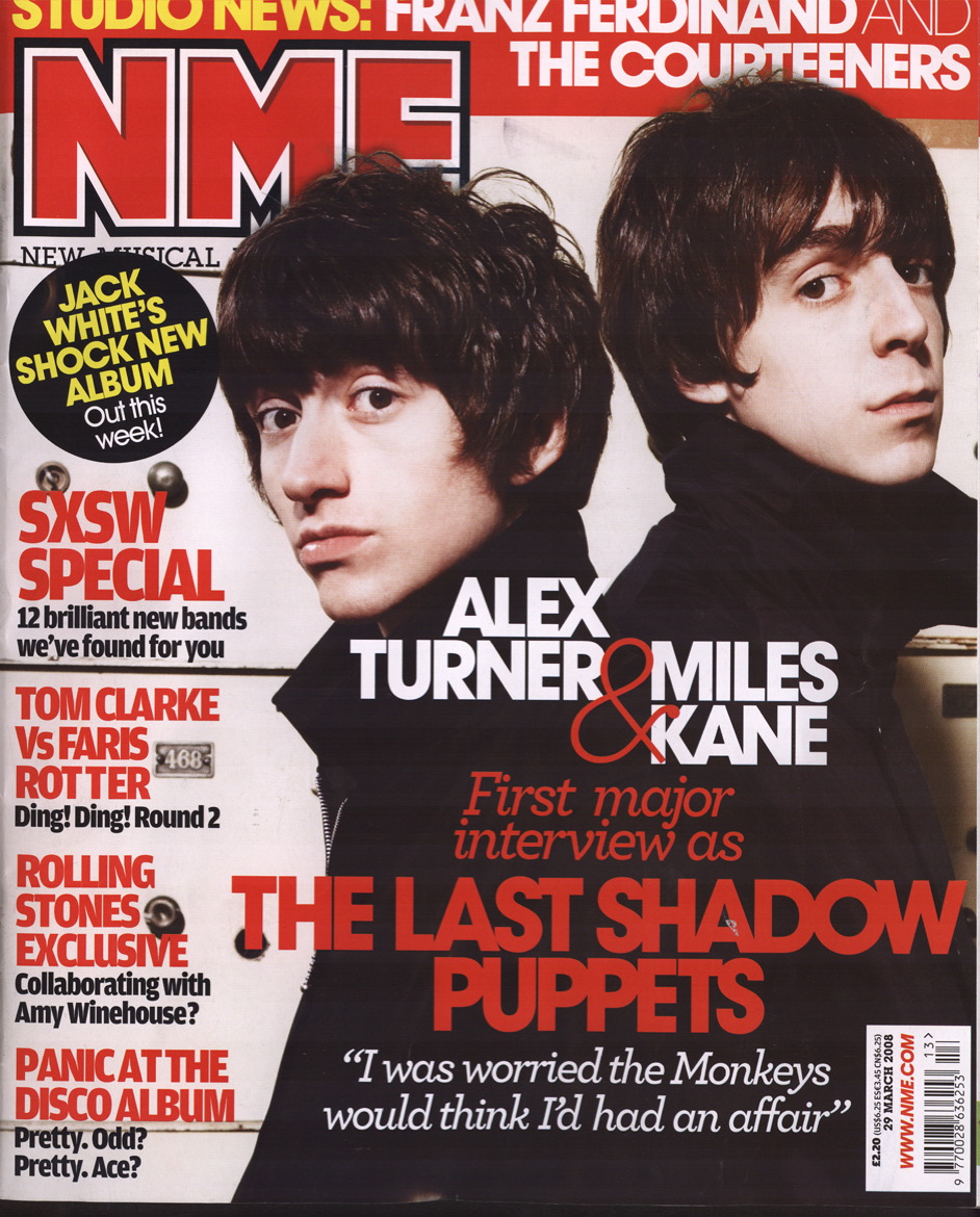
I liked this front cover as the colours used are minimal giving it a house style and the to main image is Alex Turner and Miles Kane standing back to back all in black, it makes them seem close. Miles Kane's facial expression seems like he has just done soething he shouldn't of done. The image also directly addresses the reader which is a typical convention of a music magazine, as weel as the fact that the main image is also the largest which is also a convention of a music magazine. The image is also the bigest advertisement the magazine has. The audience of this magazine is mid-teens to early-twenties, of both genders. The colours are used as so they don't anything away from the main image. The heading of the magazine is slightly hidden behind the head of Alex Turner, this is not a typical convention f music magazines. Only well-known, well known magazines could do this as their heading is well recognised and known. The heading of NME is always in red, and is a distinctive heading. It will also alert regular buyers of the magazine. The sub-heading 'THE LAST OF THE SHADOW PUPPETS' is larger than the rest of the sub-headings as it is the name of the band on the frony cover and so is fiven the most publicity. The rest of the sub-headings do not have images with them but do stand out due to their bright red font is on a a white background. And with words such as 'exclusive' and 'special' makes the reader want to read the articles as the sub-headings give away hardly any information on the articles.
No comments:
Post a Comment