Monday, 25 January 2010
Representation & Audience
 This is a poster for Babyshambles in concert.
It is very minimalistic with only one main image which is a convention of a poster. It's very 'to the point', the heading is the name of the band and the sub-heading is the date of the concert and where the concert is being played. The largest words on the poster is 'Rock City' which is the venue. This is strange to me as i would of advertised the band more than the venue. The image is an action shot and shows the frontman, Pete Doherty singing. I believe my audience would be same as those who would like Babyshambles, as the band are very much like a band i'd have in my magazine.
I think Babyshambles are a typical Indie Rock band in the way they represent themselves in a very 'we don't care' way, they dress, act and perform in a certain way to show this.
My Unique Selling Point (USP)
My unique selling point is that there are no other magazines out there that are mainly based on unsigned bands or artists. The closest thing on the UK market like it is probably NME. I believe my magazine would take some readers of NME as it is all about new music. So i think my magazine, NME and possibly Kerrang would be competing for the same audience.
Sunday, 24 January 2010
Questionaire
I created a questionaire to gather some research on my chosen indie/rock genre. I wanted to find out how people now get their music information, by internet, TV or magazine and if a particular genre uses a specific media channel (ie. TV, Radio, Print etc.)
!) How old are you?
13-16 16-18 18+
2) What gender are you?
Male / Female
3) How often in a week do you use the internet?
Once a...
Day
2 days
4 days
6 days
4) Do you buy music magazines?
Yes / No
5) If yes, which genre?
R&B
Indie
Rock
Pop
Bangra
Classical
Dance
6) How often do you buy musci magazines?
Weekly
Fortnightly
Monthly
More than once a month
7) Do you read articles on music websites
Yes / No
8) If yes, how often do you read articles on the website?
Daily
Few times a week
Weekly
Monthly
More than monthly
How do you prefer to read music articles?
Magazines
Websites
Other
Narrative
My music magazine will follow a typical narrative structure as it is popularly used in music magazines and so it will be well received by readers of my article. The typical narrative is easy to understand and recognise. I will use the narrative as and when i need to.
My Moodbaord


Spread Cover Research
I believe that the double spread will be the hardest of the three parts to execute well as i will have to incorportae alot of text aswell as images.

CONTENTS ONE: I like this double spread but it breaks alot of conventions. Firstly, there's only one image whereas there is usually several pictures dotted around the article. There's no white space which isn't bad as the image fills most of the double page. The text grad is black on white in contrast to the rest of the interview which makes in stand out. Although it is quite long for a text grab. I like the idea of this page, i also would like a main picture that grabs the readers eye, I find the image itself says alot about the artist, it emits class and attention to detail which the artist, Jay-Z has in abbundence. It also makes him seem a refined character. Although this interview is bigger than a double spread interview i found the layout of it interesting.
 CONTENTS TWO: I like the image on this page as it contrasts with the white background with Noel Gallagher in a black jacket and the shadows on his face show his age, that as well as the large text grab caption, 'Now i'l tell you a fucking story...' makes him seem a veteran of the music world with alot of atories to tell. The sheer simplicity of the layout is i think executed well, as the text garb is clear but does not take away from the image. I'm guessing that Noel is their to promote something although that isn't always the case, but most of the time it is. My article will be question and answer, unlike these two. It will also be targetted at the Indie/Rock audience.
Contents Page Research
 CONTENTS ONE: I found this contents page interesting as the main image covers the whole page and this isn't a convention of a music magazine. I also like how the the colour of the background matches Dave Grohls t-shirt. It's not bright and colourful, so it doesn't follow the conventions of contents pages but it does encourage the reader read on as the main image does that. There's more than one image so you can 'graze' images as on most contenst pages. The main image doesn't directly address the reader and the contenst pages is in sections which is a covention of contents pages,
I think i will only have one image on my contents page, this will break the convention of contents pages but i believe i can make it work.

CONTENTS TWO: I think the images are used really wel on this contents page, they are used in a collage effect around the sub-headings of the contents page. We can also see that all the people in the images directly address the reader. The bands and artists are all dressed in earthy colours as too not distract the readers from the headings, telling us what's in the magazine that issue. The use of space in giving more of it to the images means that the headings look shorter and the page doesn't look 'wordy'. The reader can definately 'graze' the images. The header however isnot at the top of the page, which is breaking the conventions of a contents page. The images are the same size but they are still asthetically appealing, the shadows used in some of the pictures is used well. The colour scheme for the fonts is balck and re which are typical colours for the rock/indie genre.
Front Cover Research
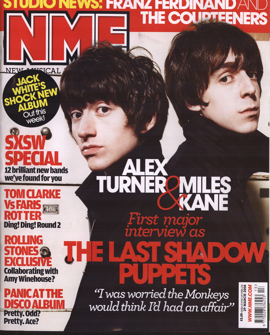
I liked this front cover as the colours used are minimal giving it a house style and the to main image is Alex Turner and Miles Kane standing back to back all in black, it makes them seem close. Miles Kane's facial expression seems like he has just done soething he shouldn't of done. The image also directly addresses the reader which is a typical convention of a music magazine, as weel as the fact that the main image is also the largest which is also a convention of a music magazine. The image is also the bigest advertisement the magazine has. The audience of this magazine is mid-teens to early-twenties, of both genders. The colours are used as so they don't anything away from the main image. The heading of the magazine is slightly hidden behind the head of Alex Turner, this is not a typical convention f music magazines. Only well-known, well known magazines could do this as their heading is well recognised and known. The heading of NME is always in red, and is a distinctive heading. It will also alert regular buyers of the magazine. The sub-heading 'THE LAST OF THE SHADOW PUPPETS' is larger than the rest of the sub-headings as it is the name of the band on the frony cover and so is fiven the most publicity. The rest of the sub-headings do not have images with them but do stand out due to their bright red font is on a a white background. And with words such as 'exclusive' and 'special' makes the reader want to read the articles as the sub-headings give away hardly any information on the articles.
Genre Research
I am doing an indie/unsigned magazine, It is quite a specific genre in that there are not many magazines out there like it. I chose this genre as i feel it is the genre i have the most knowledge about and i am intersted in the genre.
My magazine has to fit into the image of the target audience, for example the editors at Kerrang would use bright pink for their title and Vibe is not likely to have the Cheeky Girls on the front cover. Every magazine has to play to the their target audience and give them what they want or the magazine would not do well. Everything from the name, fonts you use and the colours you use. The music magazine that's most like the magazine i want to make is NME.

My magazine has to fit into the image of the target audience, for example the editors at Kerrang would use bright pink for their title and Vibe is not likely to have the Cheeky Girls on the front cover. Every magazine has to play to the their target audience and give them what they want or the magazine would not do well. Everything from the name, fonts you use and the colours you use. The music magazine that's most like the magazine i want to make is NME.

Subscribe to:
Posts (Atom)